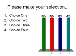
Make your audience response questions visually appealing by matching them to your slide template. If you use TurningPoint, there isn’t much that you can’t customize on your question slides because the objects that it places on your slides are in fact PowerPoint objects. Follow these simple steps and your questions will look better in no time. I can’t promise that you’ll be creating a work of art, but I can say that the slides will be easier on the attendees’ eyes.
The image on the left is the default formatting of a question slide and the image on the right is what you would like your end product to be
- Add the slide: Insert Slide –> Generic Slide –> 4 Answer
- Apply the correct PowerPoint slide master: Format –> Slide Design –> Design Templates
- Edit the chart colors: From the TurningPoint toolbar click Tools –> Settings –> Presentation –> Set Chart Colors to User Defined
- Specify your colors: I have no idea why TurningPoint limits your palette to 40 colors. With the limited choices, I almost always use the same colors, Green (153, 204, 0), Orange (255, 153, 0), Blue (51, 102, 255) and Yellow (255, 255, 0). The color choice selection is up to you.
- Place a white outline around your chart: The white border seems to make the chart bars pop, whereas the default black border does not. Format –> Slide Design –> Color Schemes –> Edit Color Schemes –> Change the color of Text and Lines to the shade that is slightly darker than white.
- Customize the countdown timer: While you are in the Edit Color Schemes menu, change the color of Accent to easily change the color of the Gemstone countdown timer.
Don’t forget to position the elements on you slide so they don’t overlap (Chart over answer choices, countdown over logo, etc.) That is all until next time.


